Color Psychology and Your Website Conversions
While walking through a grocery store, you may have noticed that the branding for most pasta sauce is red with possibly a yellow label. Maybe you’re walking through the toiletries aisle and notice that women’s products are lighter colors like pink, blue or green, while the men’s toiletries are dark blue and black. What you may not necessarily see is how much strategy and thought went into choosing those colors.
There are even companies solely dedicated to testing and conducting research on these kinds of topics to provide marketers and businesses a better idea of the psychology behind color and how they can utilize it to their advantage to make more sales. In fact, according to DesignAdvisor, 60% of acceptance or rejection of a product can be attributed to its color. Additionally, DesignAdvisor has also noted that product assessment takes 90 seconds. In which, between 62% and 90% of this judgment is based on color alone.
Did you also know that color impression is said to be responsible for 60% of the acceptance or rejection of a product and 80% of brand recognition? Also from the same report, to 84.7% of consumers, color is the main reason for buying a particular product.
A significant example of this came from Heinz, which conducted a marketing experiment where they changed the color of their signature ketchup from red to green. The results of this experiment ended in over 10 million bottles sold during the span of seven months. This also led to $23 million in sales – their highest sales increase in the brand’s entire history.
This same idea can be translated to your website design. We’ve previously expressed how important your design is to keeping your visitor engaged and ultimately converted into a customer. But just to convince you even more, 42% of shoppers base their opinion of a website on overall design and 52% say they won’t return because of overall aesthetics. So if you haven’t refreshed your website design in a few years, it’s time to give us a call.
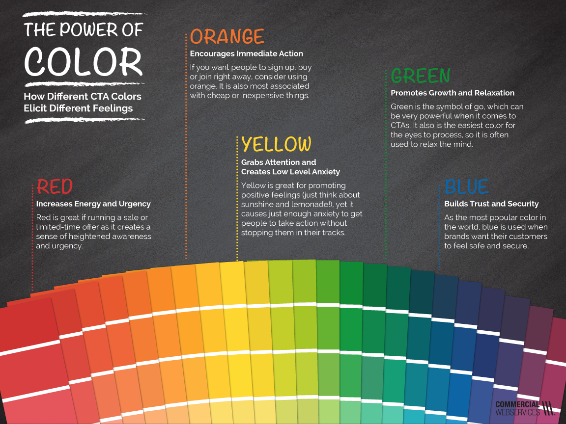
One of the biggest yet simultaneously subtle changes you can implement on your website, is changing your Call-to-Action buttons to a different color. Research mentioned by DesignAdvisor indicates that red, orange and green are the best button colors for conversions, but only if they stand out. For example, if you have a background behind the button that is already one of these colors, or an image behind it with similar coloring, you’ll want to think about a different button color strategy.
Hubspot revealed that when testing this knowledge, their red button outperformed their green button by 21%, which was based on 2,000 website visits. It’s not just Hubspot experiencing this though, Beamax had a 53.13% increase in clicks on a red link compared to the blue link they had previously.
If you want to learn a bit more about the significance of color and what it could mean to your customer, check out the infographic we’ve created below. If you want to see what different companies and industries are using for their brand colors, you should check out this infographic from DesignAdvisor where a lot of the information in this blog post came from.
It’s important to note that 93% find the visual as the #1 influencing factor affecting their purchase decisions. So take a look back at the colors you’ve chosen, whether it’s for your logo, sales collateral, or most importantly your website. It could be subtly impacting your customer’s decision. Want to potentially revisit these and get some design input? Just give us a shout at marketing@commercialwebservices.com.